Faceplant is a barbershop based in Worthing, but from the very start this project was about more than haircuts. The ambition was clear: build a brand with enough personality and flexibility to extend into merchandise, culture, and community, not just sit quietly above a shopfront.
One thing was non-negotiable. This couldn’t look like a barbershop. No scissors. No barber poles. No bearded clichés recycled for the thousandth time. Instead, the client asked for something unexpected: a character-led logo featuring a mulleted man in sunglasses and a trucker hat. They envisioned a cartoon style that would bring lots of personality. During our discussions, reference points like Stüssy and the Wu-Tang Clan logo kept coming up, firmly positioning 90s skate culture as a key source of inspiration.
DESIGNING A CULTURE-LED BRAND FOR A MODERN BARBERSHOP
FACEPLANT
LOGO DESIGN
2025
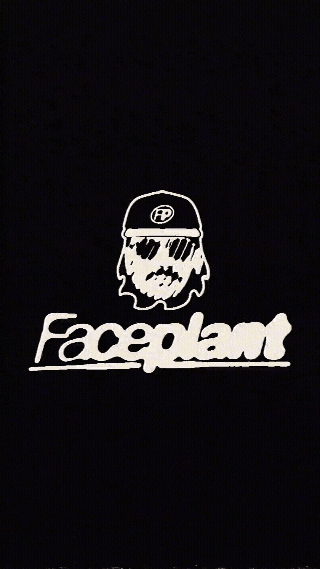
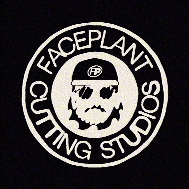
I took that idea and decided to give them something unexpected in return. In my design presentation, I created two options that were exactly on brief - a modern, cartoon-style mascot - but I knew the idea could be pushed further. For the final direction, I moved away from the cartoon approach and explored something I’d wanted to try for a long time: a realistic face built from just two colours using a halftone pattern. A logo that, unlike most, actually looks better the further away you are. As you zoom out, the seemingly random shapes resolve into a recognisable face, meaning the shop’s logo can be read clearly from the other end of the street.
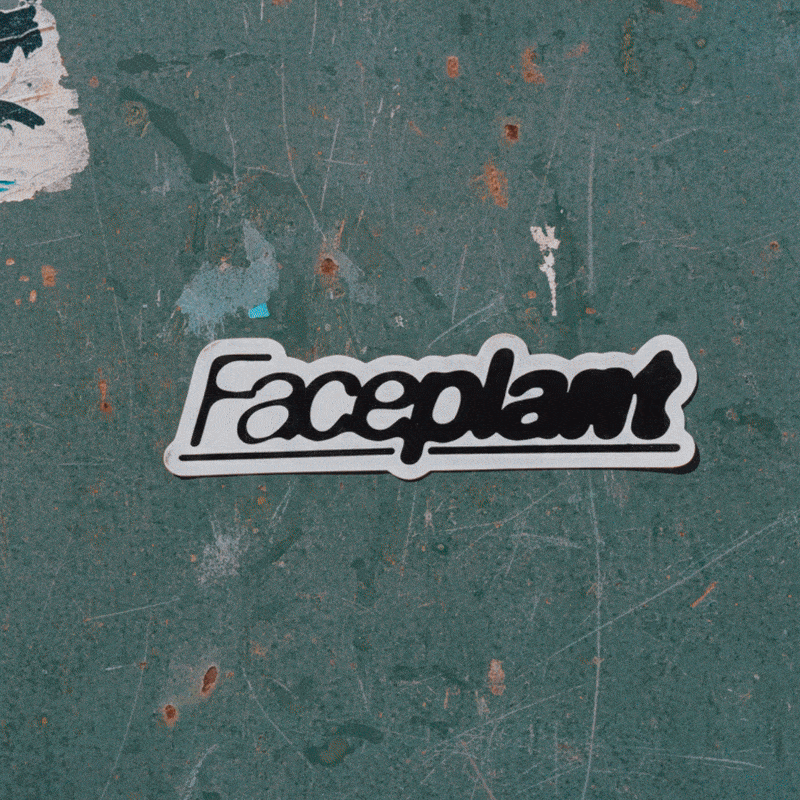
This set the tone for a grungy, texture-led identity, where rough edges were favoured over polish. With an ink-bleed inspired wordmark to suit, the logo was complete.