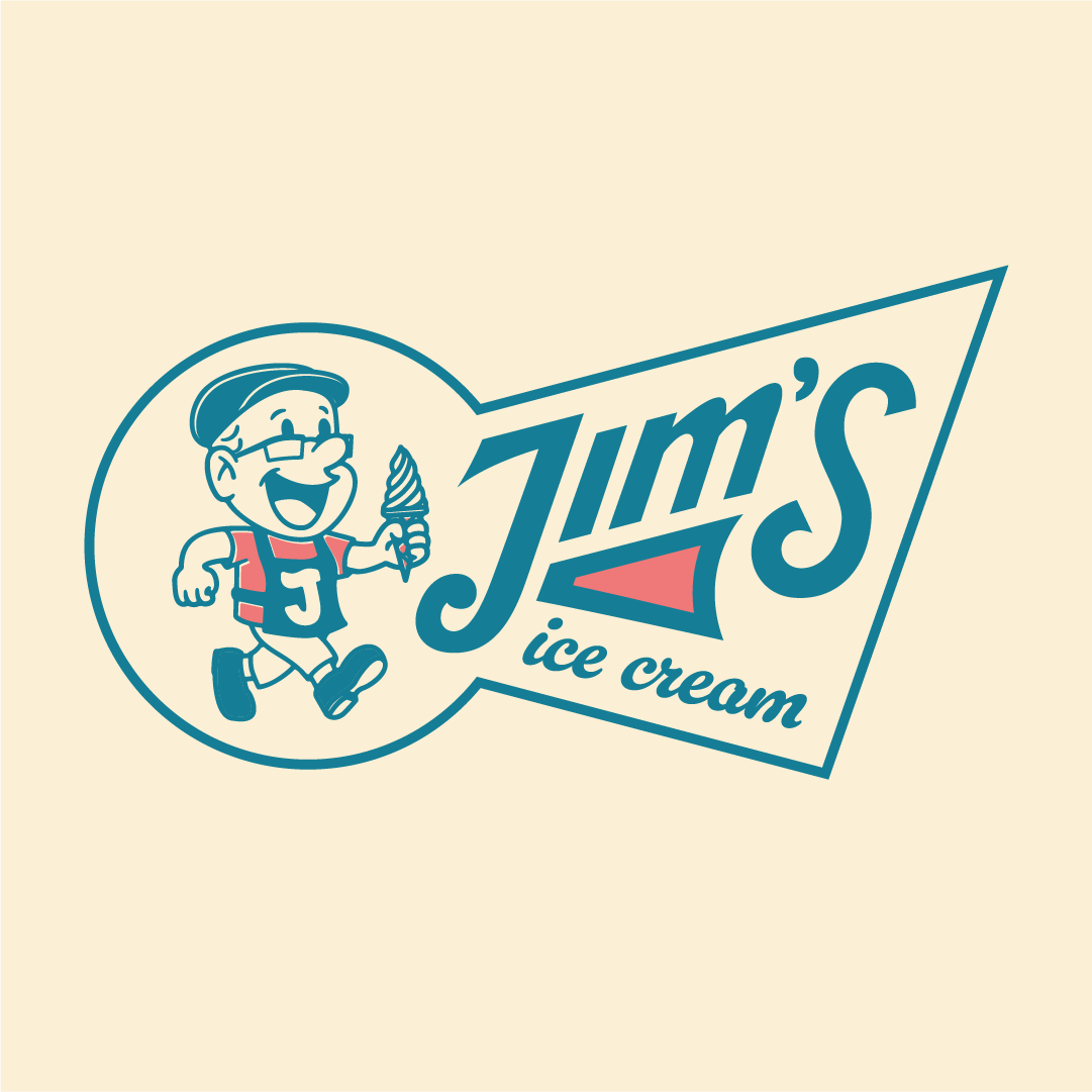
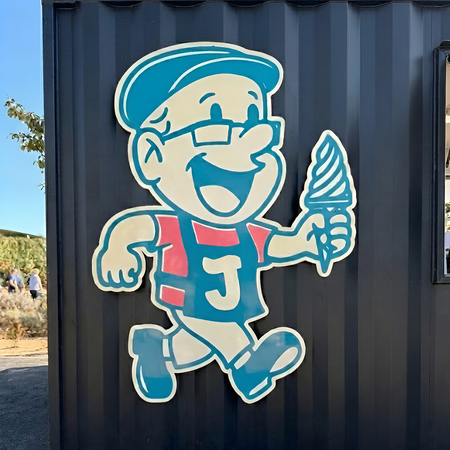
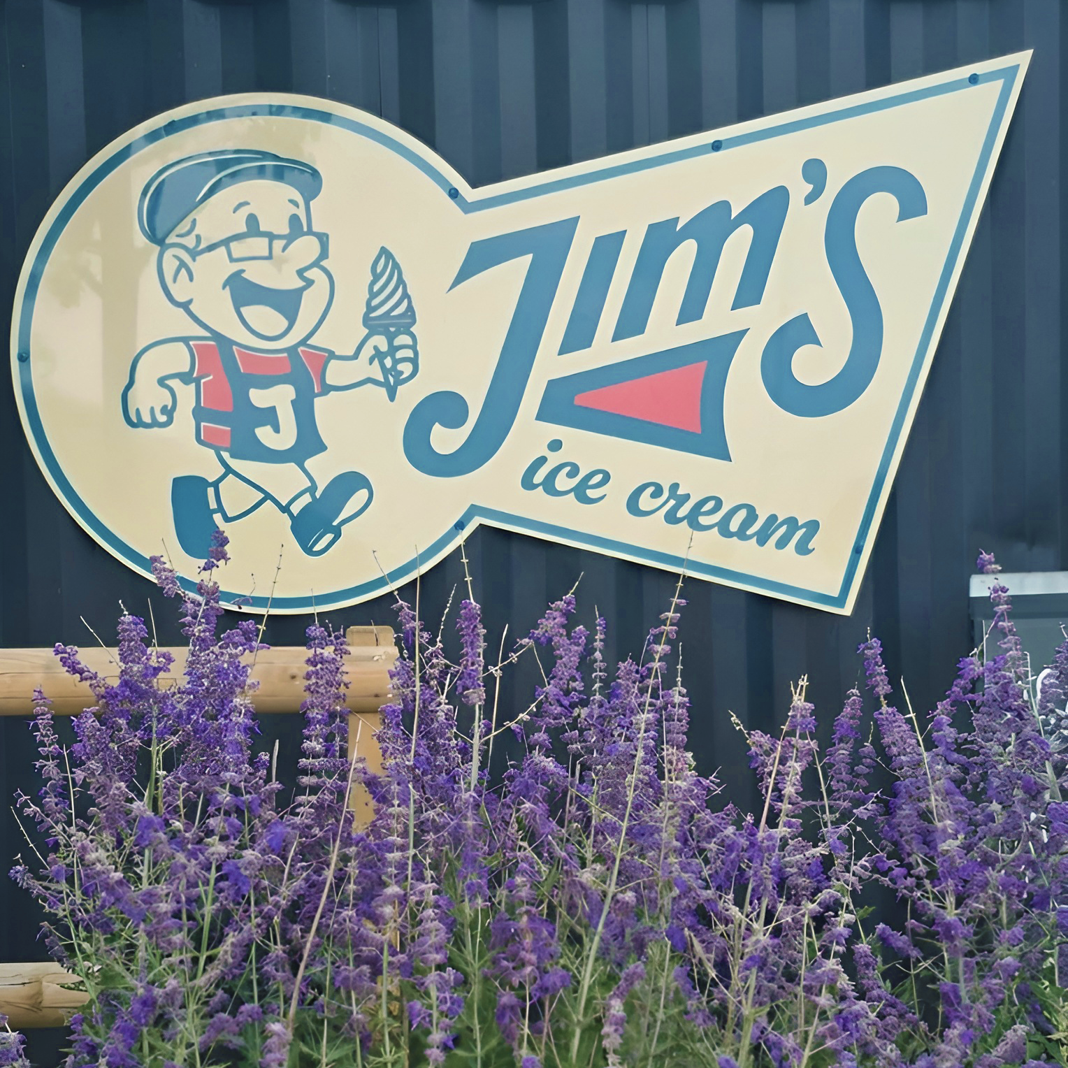
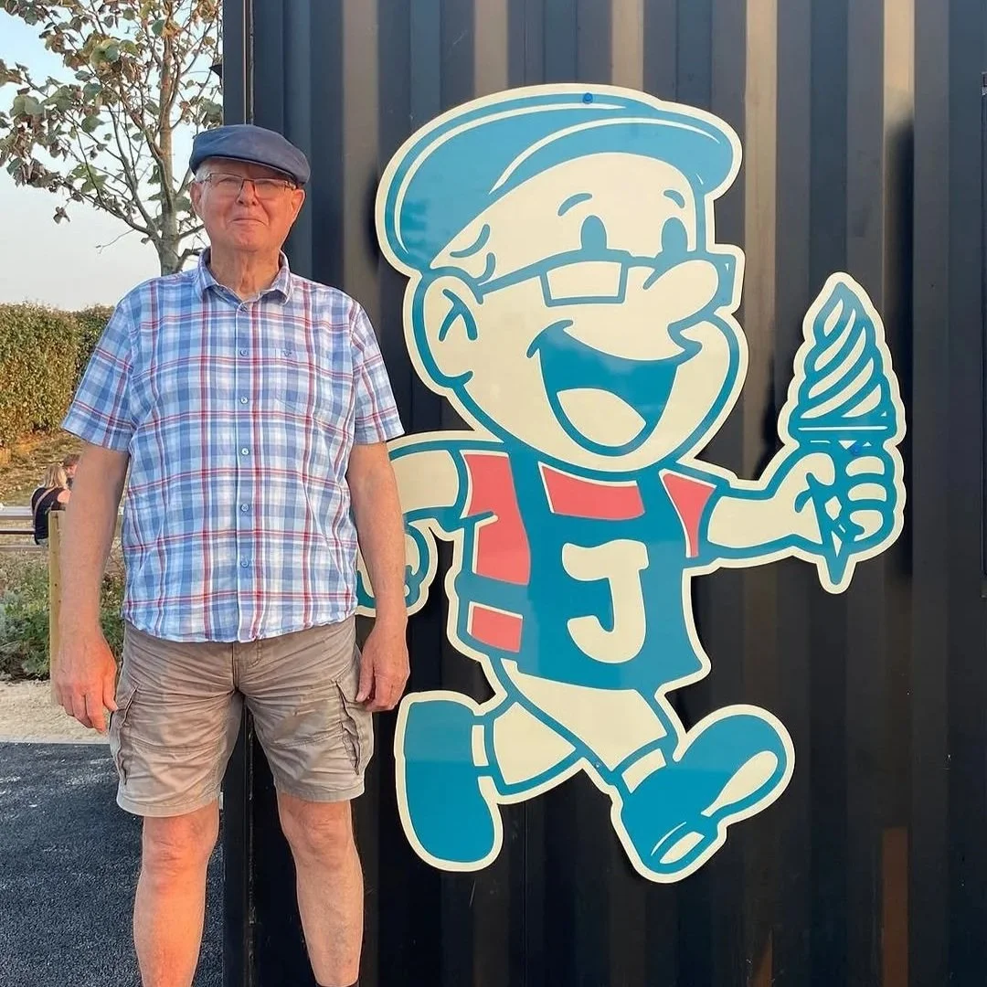
Jim’s Ice Cream is an independent Ice Cream Kiosk in West Sussex set up to honour a pillar of the local community - Grandad Jim!
When Howie, the owner of Jim’s Ice Cream approached me to help with this logo he had a very specific vision in mind. To immortalise his grandad Jim as the mascot of Jim’s Ice Cream. After a few lack-luster AI image generation attempts, they realised only the real thing would do!
A VINTAGE INSPIRED ICE CREAM KIOSK HONOURING A LOCAL LEGEND
JIM’S ICE CREAM
VISUAL IDENTITY
2025
I created several different ideations of a Jim’s mascot, but we settled on one based on the iconic cartoons of the 1960s, avoiding the now cliché 1930s rubberhose cartoon style, this logo is full of personality with an equally characterful wordmark to suit.
A considered colour palette of vanilla white, strawberry pink and a vibrant blue to contrast nicely was established and Jim’s Ice Cream was born!